MySunBuddy
A fresh look for a solar energy marketplace.
The challenge
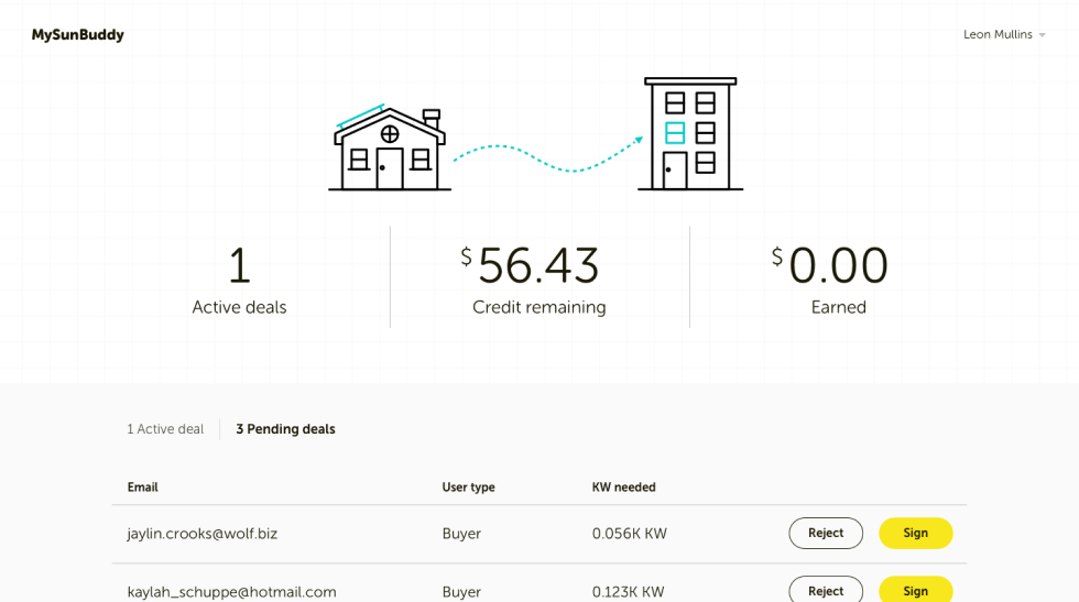
MySunBuddy approached DockYard with a fixed budget, short timeline, and goal of developing it’s UI and branding to appeal to a niche target audience.
The solution
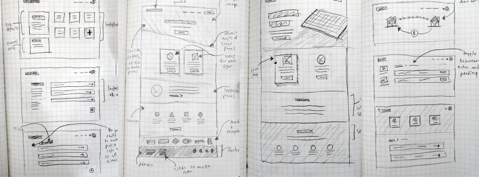
01 Moving Fast with Hand Sketches
MySunBuddy is a marketplace for solar power, leveraging the clean energy movement, where people with solar panels can use what they generate or connect with buyers to sell excess energy.
After a high level discussion regarding product vision, our next step was to begin sketching. To convey concepts quickly, we produced low-fidelity sketches. This allowed us to analyze several visual and content ideas before collectively settling on a way forward. This exercise yielded direction for layout, placement, and styling.
02 A Dashboard That’s Easy to Use
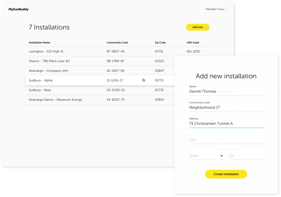
Using our sketches, we began constructing our interface. Knowing the content was staying the same for the most part, refining the UI was really an exercise in developing a clean and clear layout—something that was missing in the previous designs.
The visual design approach focused on clear calls to action, a strong hierarchy on the page, and user-friendly forms. We created a modular solution for future use as well, splitting up complex interactions into smaller, self-contained steps and showing each on its own screen.
03 A Homepage Focused on Customer Acquisition
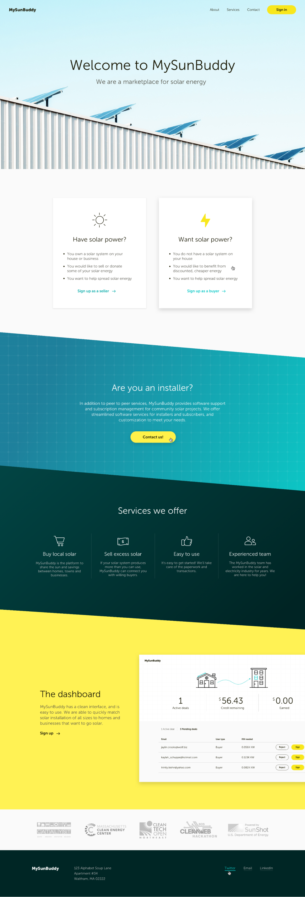
MySunBuddy’s top priority is to gain the trust of paying customers. Because of this, we knew that establishing a strong visual identity and homepage was crucial. MySunBuddy needed to showcase the product, incentivising users to sign up. We needed clear user actions that inspired confidence. The overall styling had to reflect the contemporary and forward-thinking values of the company.
04 A Design System That Lasts
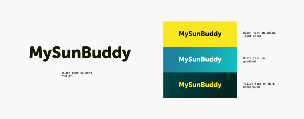
At DockYard, when we design products, we simultaneously consider branding. Product experience is as much if not more important in a company's identity than a logo. For MySunBuddy, we approached branding not as a separate exercise, but as a component to strengthen and solidify the experience.
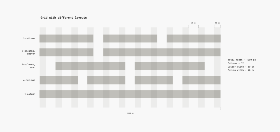
We selected colors that felt clean, vivid, and bright, a collection that when paired with the name, simply made sense. We selected typography and iconography that was legible, accessible and friendly. To assist in building future features, we provided guidelines for implementation.
DockYard’s speed and diligence with sticking to timelines was second to none. In the exact timeline they had anticipated, we had all of the things we white-boarded out with DockYard, done. Product management was excellent. Outstanding.
