CollegeVine
Demystifying the complex world of school applications.
The challenge
CollegeVine needed a user experience that felt more intuitive and intimate for employees and clients navigating the typically stressful college admissions process. The company wanted to reduce risk around new features, and the whole web experience needed to scale.
The solution
01 Understanding user needs
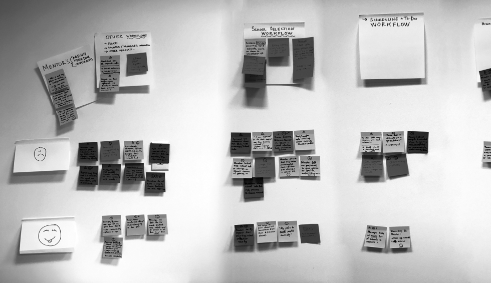
User testing and interviews helped DockYard design an intelligent user interface and workflow to support interactions between varied clients and internal users. These designs supported both CollegeVine staff and end user goals, especially around the development of to do lists, de-stressing tasks, and maintaining a clear way forward for clients in their college search and application process.
Interviews helped outline user priorities which were presented to CollegeVine. These unexpected observations helped to challenge assumptions and solidify a direction forward.
02 Designing good questions
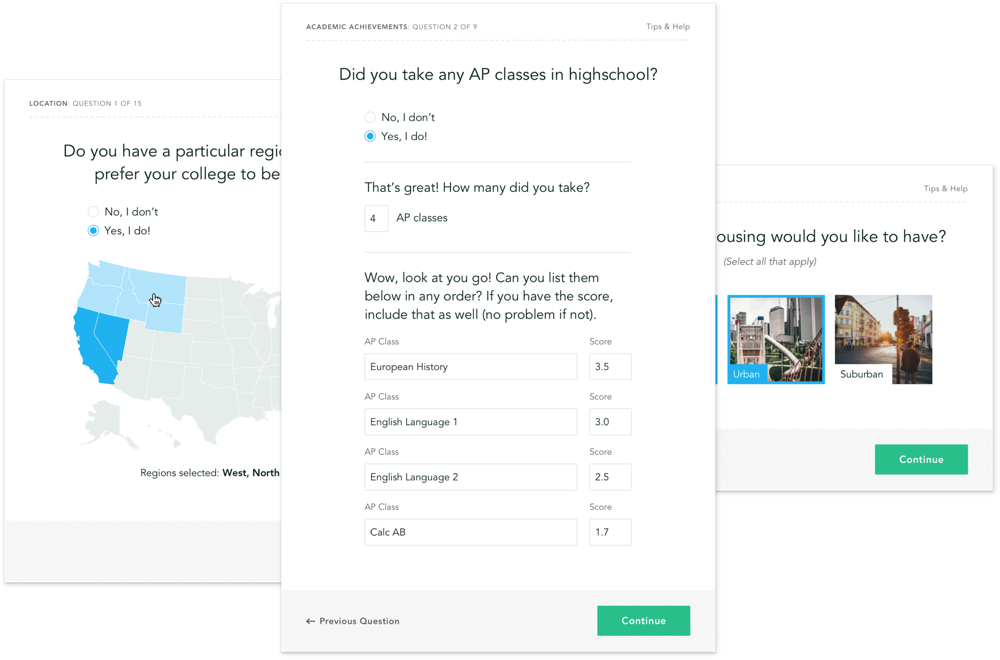
Determining user preferences when it comes to school selection is very important (e.g. think city vs rural, small vs big, etc.). Part of understanding user needs is asking the correct questions.
CollegeVine approached us needing help designing a questionnaire that would be more intuitive and user-friendly. Our solution was to simplify, presenting questions in a digestible format. One of CollegeVine’s strengths is their one-on-one mentorship program, where users can learn about applications from an expert. We wanted preference selection to mimic that intimate relationship—making users feel they were heard and could trust the recommendations.
03 Clear and accessible results
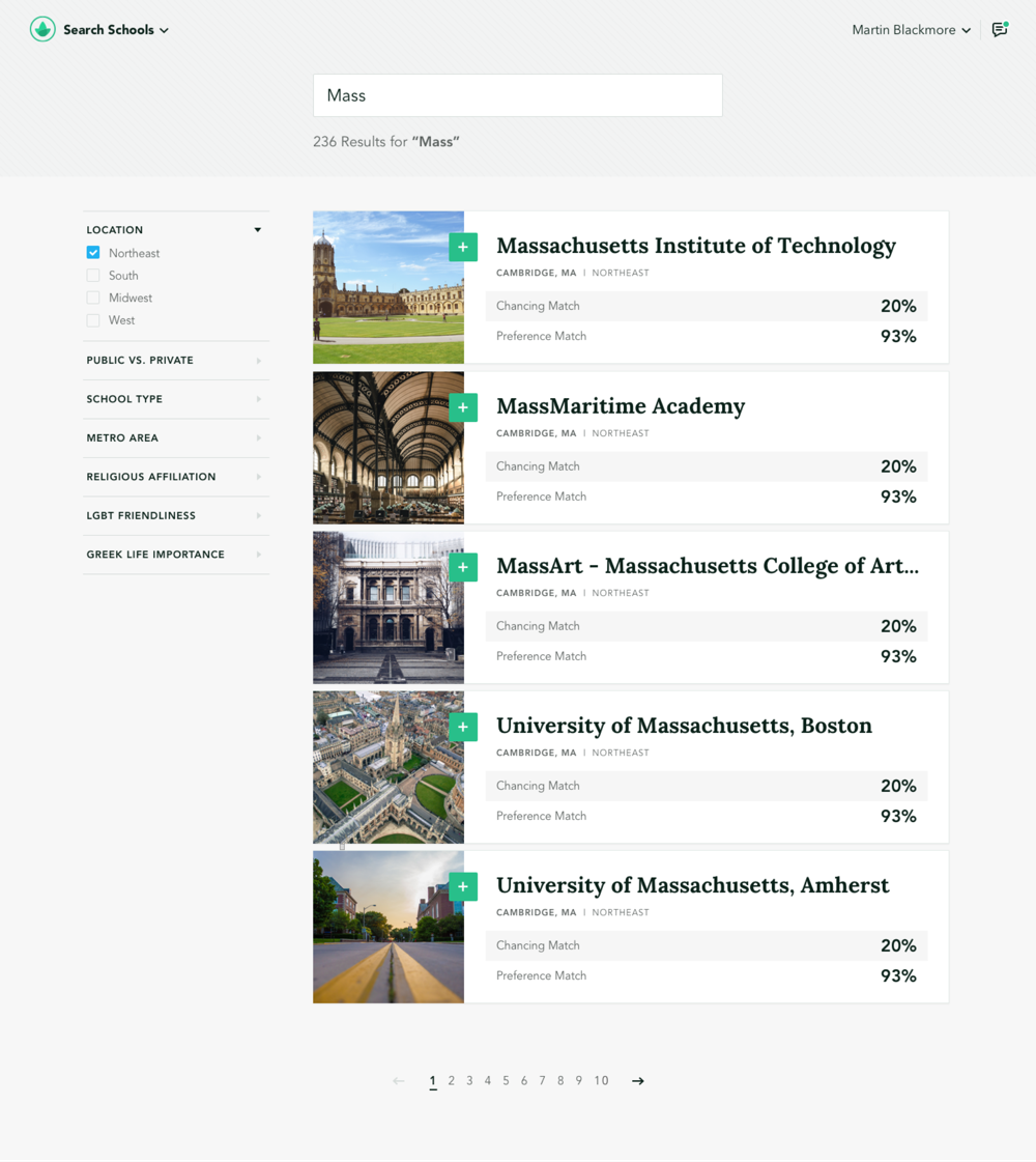
Although one of CollegeVine’s biggest features is recommendations based on user preferences, after discussions with users and the client it was made clear that a search feature would also be valuable. But students need to see potential schools in the context of their chance of getting in. We created a search experience with results that feature their chances. Doing so utilizes information that was gathered about the user and presents it to them in a way that is contextually relevant. This keeps expectations realistic and helps to showcase CollegeVine as an expert in the field.
04 School metrics tailored to users
School characteristics are extremely important to potential students. They communicate everything from tuition costs, to diversity on school campus. Ultimately this information is what drives a student to make a decision on a school.
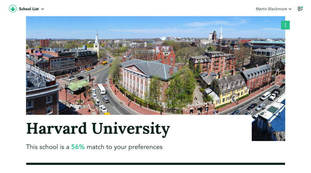
What we found in user research, however, is that each student tends to rank statistics, ordering them based on preference. Our solution was to utilize information gathered during the questionnaire and then present it back to the student, highlighting where a particular institution aligns or misaligns with their expressed interest. The result is a set of characteristics personalized to the user’s preferences, visible across any of the schools in their list.


"We’re never afraid to invest in design because it de-risks engineering implementation down the line."
05 A to-do list that resolves ambiguity
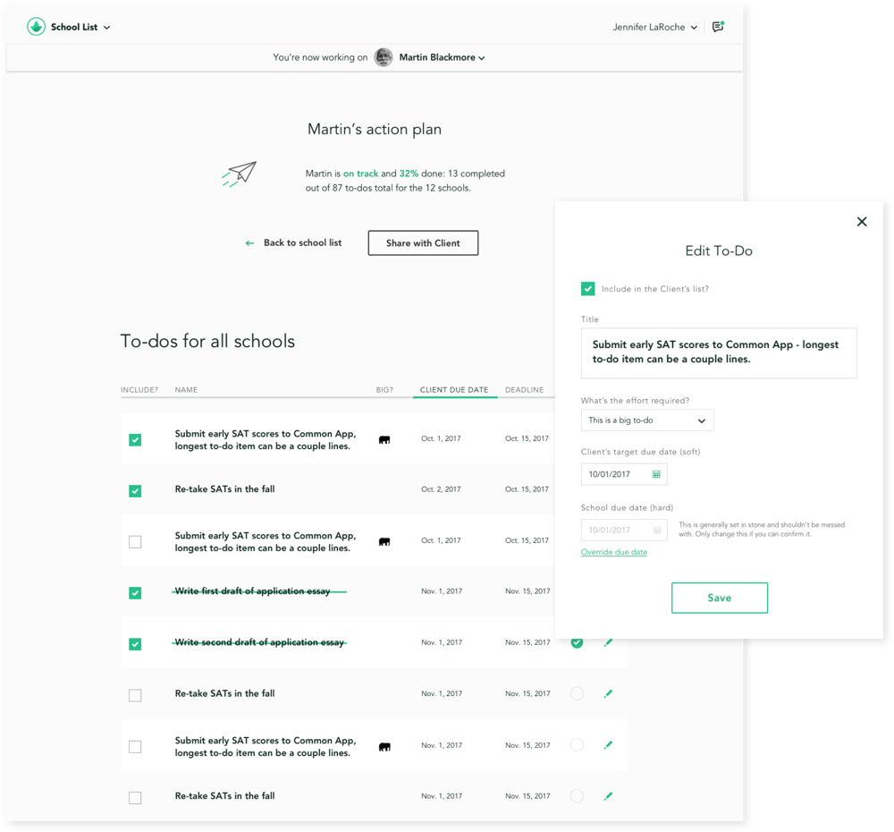
To-do lists allow consultants to customize next steps for students as well as support their ability to easily ensure steps are being completed in a timely manner for multiple clients.
For clients, to-do lists leave no ambiguity about the next steps in their process and ensure no steps are missed. Internally for CollegeVine, providing this reassurance for clients is essential in maintaining it’s signature quality of service as it scales.
Clients receive in-depth, customized assessments of how each school on their list would fit their own preferences, but they also see an overall risk and certainty assessment for their entire portfolio of schools. All these assessments are communicated through a clean, elegant design that captures clients’ attention and reinforces their trust in CollegeVine.
