
Introduction
In part 1 we started exploring how to emulate polar plots in VegaLite. Now, we will expand on this idea by analyzing a more complete version of Little Wing’s (Brian’s boat) dataset.
Graphical Interpolation
First, let’s install all of the dependencies we’ll need. Notice that we are installing some libraries from the Nx ecosystem.
Mix.install([
  {:scholar, github: "elixir-nx/scholar"},
  {:kino_vega_lite, "~> 0.1.3"},
  {:jason, "~> 1.4"},
  {:exla, [github: "elixir-nx/nx", sparse: "exla"]},
  {:nx, [github: "elixir-nx/nx", sparse: "nx", override: true]}
])

# Configure EXLA as the default backend for Nx
Nx.default_backend(EXLA.Backend)
Then, using the same PolarPlot module that was created in the previous post, we can plot our data to get a feel of how it is laid out.
opts = [
  theta_offset: 0,
  width: 600,
  height: 600,
  opacity: 0.5,
  stroke_color: "white",
  stroke_opacity: 0.5,
  angle_marks: [30, 45, 60, 75, 90, 105, 120],
  radius_marks: [4, 5, 6, 7, 8]
]

theta = Enum.to_list(40..120//10)

r6 = [4.4, 5.1, 5.59, 5.99, 6.20, 6.37, 6.374, 6.25, 6.02]
r8 = [5.41, 6.05, 6.37, 6.54, 6.72, 6.88, 6.99, 6.98, 6.77]
r10 = [5.93, 6.38, 6.68, 6.9, 7.1, 7.2, 7.35, 7.48, 7.37]


vl_grid = PolarPlot.plot_grid(opts)

data = [
  {r6, theta, :line, grouping: 6, point: true, interpolate: "natural"},
  {r8, theta, :line, grouping: 8, point: true, interpolate: "natural"},
  {r10, theta, :line, grouping: 10, point: true, interpolate: "natural"}
]

vl_data = PolarPlot.plot_data(vl_grid, data, [{:stroke_opacity, 1} | opts])

svg_contents = VegaLite.Export.to_svg(vl_data)
File.write("/tmp/plot.svg", svg_contents)

vl_data

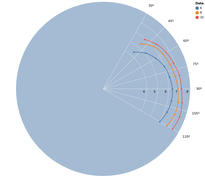
Notice that we use the tws value for each line as the :grouping value, which will become relevant later, when we plot the points separate from the lines due to our custom interpolation strategies. Aside from that, we can see that our data is limited between the angles of 52º and 150º, and that because our lines are plotted in a hidden cartesian plane, the automatic linear interpolation results in straight lines instead of curves as we would expect in a polar plot.
We can fix this problem through data interpolation, which is a fancy word for creating data that makes sense (in a given context) from pre-existing data. From now on, we will focus on linear interpolation and cubic spline interpolation.
The first experiment we can conduct is to play with the :interpolate mark option for VegaLite. This will yield a smoother plot, but has two main problems. The first is that we only have lines inside the limits of the dataset (with custom interpolation we can extrapolate outside the data) and the second problem is that we don’t have access to the interpolated data, which makes this only useful for graphical analysis.
data = [
  {r6, theta, :line, grouping: 6, point: true, interpolate: "linear"},
  {r8, theta, :line, grouping: 8, point: true, interpolate: "linear"},
  {r10, theta, :line, grouping: 10, point: true, interpolate: "linear"}
]
To deal with these problems we can use Scholar. It will enable us to have absolute control over how the data is interpolated and will also allow us to extrapolate data beyond the points we have.
Data Interpolation
Scholar is a library from the Numerical Elixir family which contains some higher-level applications, including interpolation functions. We can experiment with two approaches.
The first approach, which might be enough in some cases, is to use linear interpolation. If we interpolate the polar data linearly before plotting, we get a smoother curve than the default, because this interpolation happens in the polar domain instead of the plotted rectangular grid (remember that the line plots ultimately occur in the rectangular domain).
The other approach is the Cubic Bezier Spline interpolation, which fits 3rd-degree polynomials between every two points, and is the strategy used by the “natural” interpolation from VegaLite. This is one of the more generic interpolations for when we don’t have any a priori expectations for the graph, and has the advantage of local control. Local control means that badly behaved points will only affect the neighboring sections instead of the whole curve.
Before we move on, let’s load and format our dataset:
# baseline data for the boat
r_by_tws = %{
  6 => [4.4, 5.1, 5.59, 5.99, 6.2, 6.37, 6.374, 6.25, 6.02, 5.59, 4.82, 4.11, 3.57, 3.22, 3.08],
  8 => [5.41, 6.05, 6.37, 6.54, 6.72, 6.88, 6.99, 6.98, 6.77, 6.42, 5.93, 5.24, 4.65, 4.23, 4.07],
  10 => [5.93, 6.38, 6.68, 6.9, 7.1, 7.2, 7.35, 7.48, 7.37, 7, 6.57, 6.12, 5.61, 5.16, 4.97],
  12 => [6.15, 6.56, 6.86, 7.1, 7.3, 7.49, 7.65, 7.85, 7.99, 7.56, 7.12, 6.71, 6.3, 5.97, 5.8],
  16 => [6.39, 6.81, 7.12, 7.4, 7.67, 7.94, 8.17, 8.42, 8.74, 9.06, 8.36, 7.78, 7.32, 7.03, 6.89],
  20 => [6.54, 6.97, 7.3, 7.63, 7.97, 8.32, 8.68, 9.01, 9.3, 9.76, 10.32, 9.29, 8.46, 8.03, 7.85],
  24 => [
    6.61,
    7.05,
    7.41,
    7.79,
    8.21,
    8.68,
    9.18,
    9.62,
    9.92,
    10.35,
    11.2,
    11.41,
    10.12,
    9.42,
    9.11
  ]
}

# Additional data related to optimal upwind and downwind measurements
optimal_upwind_and_downwind_by_tws = %{
  6 => [{4.62, 42.7}, {5.02, 137.6}],
  8 => [{5.56, 41.6}, {5.64, 144.5}],
  10 => [{5.77, 37.6}, {5.93, 154.2}],
  12 => [{5.88, 35.6}, {6.3, 160.1}],
  16 => [{6.05, 34.4}, {7.01, 170.8}],
  20 => [{6.2, 34.5}, {9.48, 148.1}],
  24 => [{6.28, 34.6}, {11.78, 147.4}]
}

# We know the data is distributed from 40º to 180º
angles = Enum.to_list(40..180//10)

max_r_base = r_by_tws |> Enum.map(fn {_, v} -> Enum.max(v) end) |> Enum.max()

max_r_optional =
  optimal_upwind_and_downwind_by_tws
  |> Enum.map(fn {_k, [{r1, _}, {r2, _}]} -> max(r1, r2) end)
  |> Enum.max()

# calculate the max_r for our radial labeling
max_r = max(max_r_base, max_r_optional)

opts = [
  theta_offset: 0,
  width: 600,
  height: 600,
  opacity: 0.5,
  stroke_color: "white",
  stroke_opacity: 0.5,
  angle_marks: Enum.to_list(0..180//15),
  radius_marks: Enum.to_list(0..ceil(max_r))
]

grid = PolarPlot.plot_grid(opts)

opts =
  opts
  |> Keyword.put(:legend_name, "TWS")
  |> Keyword.put(:stroke_opacity, 1)
  |> Keyword.put(:opacity, 1)
The function below will be used as a generic function for interpolating and plotting the data.
calculate_plot_data = fn r_by_tws,
                         optimal_upwind_and_downwind_by_tws,
                         angles,
                         fit_fn,
                         predict_fn,
                         initial_angle,
                         final_angle,
                         interpolation_steps ->
  for {tws, r} <- r_by_tws do
    [{r1, a1}, {r2, a2}] = optimal_upwind_and_downwind_by_tws[tws]

    {r, angles} =
      [r1, r2 | r]
      |> Enum.zip([a1, a2 | angles])
      |> Enum.sort_by(&elem(&1, 1))
      |> Enum.uniq()
      |> Enum.unzip()

    interpolated_angles =
      angles
      |> Enum.map_reduce(initial_angle, fn
        curr, nil ->
          {nil, curr}

        curr, prev ->
          # set 5 steps between each interval
          step = (curr - prev) / interpolation_steps

          {Enum.map(0..interpolation_steps, &(prev + &1 * step)), curr}
      end)
      |> elem(0)
      |> Enum.reject(&is_nil/1)
      |> List.flatten()
      |> Enum.uniq()

    # also add the interval beyond the last angle
    last_angle = Enum.at(interpolated_angles, -1)
    step = (final_angle - last_angle) / interpolation_steps

    interpolated_angles =
      interpolated_angles ++ Enum.map(0..interpolation_steps, &(last_angle + &1 * step))

    model = fit_fn.(angles, r)
    interpolated_r = predict_fn.(model, interpolated_angles)

    opts = [{:grouping, tws} | opts]
    shape = ~s[circle]

    [
      {r, angles, :point,
       [{:shape, shape}, {:filled, true}, {:stroke, false}, {:opacity, 1} | opts]},
      {interpolated_r, interpolated_angles, :line, opts},
      {[r2], [a2], :point,
       [{:shape, "diamond"}, {:filled, true}, {:stroke, false}, {:stroke_opacity, 0.75} | opts]}
    ]
  end
  |> List.flatten()
end
What this snippet does can be separated in a few steps for each {tws, r} pair:
- Adds the upwind and downwind points to the data
- Generates
{radius, angle}pairs which are sorted by the angle - Calculates
interpolation_stepssteps between consecutive angles so we can ask for interpolated data at those intermediate angles. An initial angle is given so we can extrapolate the function. - Fits the interpolation to the given data with
fit_fn - Interpolates the corresponding radii to
interpolated_angleswith the newly fitted model withpredict_fn - Returns a data path configuration with points for the given data and lines for the interpolated data
The result can then be fed as data into PolarPlot.plot_data(grid, data, opts).
Linear Interpolation
# Linear interpolation in the polar domain.
# Since the data is passed as lists we need to convert to Nx tensors here
# and also return a list.
fit_fn = &Scholar.Interpolation.Linear.fit(Nx.tensor(&1), Nx.tensor(&2))
predict_fn = &(Scholar.Interpolation.Linear.predict(&1, Nx.tensor(&2)) |> Nx.to_flat_list())

# We use 4 steps because it's enough for smooth-looking graph sections
data =
  calculate_plot_data.(
    r_by_tws,
    optimal_upwind_and_downwind_by_tws,
    angles,
    fit_fn,
    predict_fn,
    20,
    180,
    4
  )

PolarPlot.plot_data(grid, data, opts)

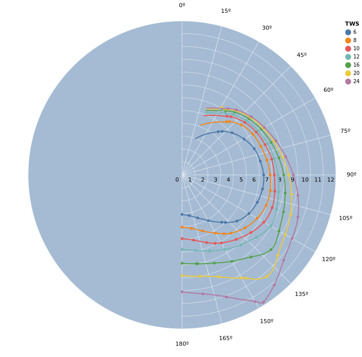
Notice that the graph is rather smooth between points, but has visible angles at some points. We should also pay attention to the extrapolated data (which goes beyond the lower limit of 52º). The extrapolated data for each line seems to make sense, but when we look at the whole picture, we see that at higher TWS the extrapolation doesn’t converge to 0 speed at 0º, which is what we would expect.
Cubic Bezier Spline Interpolation
Notice that the code is almost the same as the previous one, and the only differences are the module used for interpolation and the number of interpolation points.
# Cubic Bezier Spline interpolation in the polar domain
fit_fn =
  &Scholar.Interpolation.BezierSpline.fit(Nx.tensor(&1), Nx.tensor(&2))

predict_fn = &(Scholar.Interpolation.BezierSpline.predict(&1, Nx.tensor(&2)) |> Nx.to_flat_list())

# We use 7 steps to get a more smooth looking graph
data =
  calculate_plot_data.(
    r_by_tws,
    optimal_upwind_and_downwind_by_tws,
    angles,
    fit_fn,
    predict_fn,
    20,
    180,
    7
  )

PolarPlot.plot_data(grid, data, opts)
The result is now much closer to ideal. We can see that between the given data points, the interpolation mostly matches the "natural" interpolation from VegaLite. We also see that the extrapolation for angles lower than the lowest data point has some oscillation in some of the curves.
Fixing the Extrapolated Data
Now that we have a feel for how our data behaves with the interpolation algorithms, we can combine some ideas for a better graph.
First, we know we want {0, 0} to be included as a data point. Secondly, since we don’t have any an expectation regarding the format of the extrapolated curve,
we can use linear interpolation for extrapolating the data. Finally, we also want to force the derivative of the graph to be continuous on the place where
both algorithms meet. For this, we can sample a point of the spline right before the end and pass it as a fit point to the linear interpolation.
The following code implements all of these ideas
fit_fn = fn theta, r ->
  r = Nx.tensor(r, type: :f64)
  theta = Nx.tensor(theta, type: :f64)

  spline_model = Scholar.Interpolation.BezierSpline.fit(theta, r)

  zero = Nx.tensor([0])

  # use the tail-end of the spline prediction as part of our linear model
  dt = 0.1
  min_theta = Nx.reduce_min(theta) |> Nx.add(dt) |> Nx.new_axis(0)

  dy = Scholar.Interpolation.BezierSpline.predict(spline_model, Nx.add(min_theta, dt))

  # Fit {0, 0} and {min_theta, dy} as points for the linear "extrapolation"
  linear_model =
    Scholar.Interpolation.Linear.fit(
      Nx.concatenate([zero, min_theta, theta]),
      Nx.concatenate([zero, dy, r])
    )

  {linear_model, spline_model}
end

predict_fn = fn {linear_model, spline_model_polar}, in_x ->
  # Change algorithms where the spline ends at the lower end
  cutoff_angle = Nx.reduce_min(spline_model_polar.k, axes: [0])[0]

  x = Nx.tensor(in_x, type: :f64)

  linear_pred = Scholar.Interpolation.Linear.predict(linear_model, x)
  spline_pred = Scholar.Interpolation.BezierSpline.predict(spline_model_polar, x)

  Nx.select(Nx.less_equal(x, cutoff_angle), linear_pred, spline_pred) |> Nx.to_flat_list()
end

# We use 7 steps to get a more smooth looking graph
data =
  calculate_plot_data.(
    r_by_tws,
    optimal_upwind_and_downwind_by_tws,
    angles,
    fit_fn,
    predict_fn,
    0,
    180,
    10
  )

PolarPlot.plot_data(grid, data, opts)
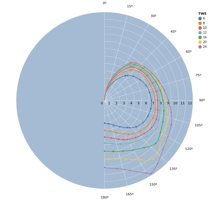
This is our final graph! It is mostly smooth even where the interpolation and extrapolation strategies meet (the last marked point on each line).
Finally, let’s summarize our reasoning for why this seems like a good graph for what we need.
The graph being smooth isn’t just a gimmick for beautiful plots. It is important to keep in mind that we are modeling a physical phenomenon.
Because we’re dealing with the way a boat behaves in the water and how it reacts to the wind, we expect that small changes in position don’t provoke big changes in the speed. This expectation tells us that the function should be smooth and this is what tells us that we should try to get a smooth graph.
This is a vast subject and a rather subjective one at times. You should take this post as an introduction to data interpolation, extrapolation, and analysis and I encourage you to experiment with other algorithms as well.
