
If you’ve ever tabbed through a website, you may have noticed outlines that appear around buttons, links, or input fields. Those are focus states. A focus state highlights interactive components, and is crucial for wayfinding when using a keyboard to navigate. Focus state users may be someone using a screen reader, a person with limited mobility, or a power user that utilizes the keyboard for faster navigation.
Each browser has a different default focus state style that can be customized to match the UI of your site. Recently, our team at DockYard set out to improve a suite of apps we developed by designing custom focus states for a design system. We stumbled throughout the process, and it took longer than expected, but we learned a few things along the way that might help someone else design focus states.
Trial and Error
Version 1—Hover as focus
 What we did: Made the focus state slightly darker than hover state. This was the least invasive option. We noticed many Google products use hover states as focus states and thought we could follow suit.
Why this didn’t work: For the focus state to be accessible, it must have a differentiating element from the hover state. The normal, hover, and focus states all need to be distinct.
Version 2—Light blue outline
 What we did: We added a 2px border to our focusable elements in a light blue, similar to how Safari handles focus states. This seemed like a good idea because it doesn’t overwhelm the element but still provides a highlight.
Why this didn’t work: The focus state needs at least 3:1 contrast with the background color.
Version 3—1px outline
 What we did: To keep the focus states from being too distracting, we changed the color of the outlines to a darker blue and created the 1px outlines.
Why this didn’t work: It fails a squint test. It’s hard to discern the button and focus state because of the thin outline.
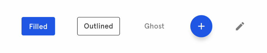
Final solution
 What we did: We added a 2px outline to all buttons set in the accent blue color. This solution created a unique focus state, had proper contrast with the background, and was bold enough to stand up to a squint test. We then customized the colors of the focus states based on our color logic. We carried these principles on to all the components in our design system.
Learning as we go
Our team also experienced some confusion about when a focus state should appear and how long it should stay visible. Some sites choose to keep focus states visible on click (such as government websites that follow strict WCAG 2.0 accessibility guidelines). However, if custom styles aren’t defined, each browser has different default focus styles and behavior. We were experiencing certain browsers that always showed the focus outline on click when we added our custom styles, while others did not. The real value of providing dedicated, custom focus styles is to unify this experience across all browsers and make sure it has sufficient contrast in each use case.
Although there is much discussion about it, it seems that in the future, developers may be able to only display focus styles when keyboard use is detected.
What we learned
- Focus styles are a design opportunity, not a compromise. With some care, they can enhance a product’s appearance and don’t have to look clunky.
- Focus states are meant to draw attention to the element. Trying to make them blend in with the UI defeats the purpose.
- Focus states need to have at least [a 3:1 contrast ratio](https://www.w3.org/TR/WCAG20-TECHS/G183.html with the background) against the background color.
- All interactive components on a page need a focus state, not just buttons or links.
- Focus states cannot just be a color change. You need a dedicated visual indicator. This could be an outline, a highlight, any sort of shape or pattern that is different from the hover state.
- Focus states cannot be the same as the hover states. However the hover state should be included with the focus styles.
- Be aware of the thickness of lines used for a focus state. Lines smaller than 2px may be technically accessible, but will be hard to see. Try using a squint test to see how low vision users might be viewing your site.
- Consider using motion to help with transition as the focus jumps from element to element. A good example can be seen by tabbing through WebAim.org.
DockYard is a digital product agency offering custom software, mobile, and web application development consulting. We provide exceptional professional services in strategy, user experience, design, and full stack engineering using Ember.js, React.js, Ruby, and Elixir. With a nationwide staff, we’ve got consultants in key markets across the United States, including San Francisco, Los Angeles, Denver, Chicago, Austin, New York, and Boston.
