
Everyone should be able to participate in the internet. As designers, our goal is to make a website intuitive and easy to use. But we’re realizing that we have been neglecting a portion of the population. 57 million Americans (over 18%) have some type of disability, and not all disabilities are visually evident.
This negligence is a byproduct of two things: awareness and comprehension. While web accessibility has become a broader topic among the design world, there is still confusion about specific rules. Many resources for web accessibility guidelines are full of code snippets and aren’t made with designers in mind. The accessibility of a product needs to start with design and continue through the product’s lifecycle.
The existing documentation is very confusing
I don’t want to blame my fellow designers for their lack of attention to accessibility. Even if you understand what accessibility is and why it’s important, it still may be difficult to put it into practice. The existing guidelines are technical, vague, and lack visual examples. They don’t want to prescribe a specific solution. If you’re like me, you try to read them, click around some links looking for visual examples, and leave the site even more confused than when you started. I’ll try to give a basic overview of what you need to know.
Let’s start with the acronyms
The World Wide Web Consortium (W3C) is an international community in which member organizations, full-time staff, and the public work together to develop web standards. They define a shared standard for web content accessibility known as Web Content Accessibility Guidelines (WCAG).
There are four areas of focus for the WCAG:
- Perceivable: content and components are presented in a way that is easily noticed and understood (i.e. readable text size and color; media is available for interaction using multiple methods).
- Operable: the user is able to perform the actions required to operate the interface (i.e. obvious navigation; navigable by keyboard; does not induce seizures).
- Understandable: Copy uses plain language and is accessible to a wide audience. Errors and feedback are clear and actionable (i.e. no industry jargon; no pop up windows; clearly labeled buttons; simple wording and instructions).
- Robust: Content is flexible across multiple operating systems, browsers, and assistive technologies.
Within the WCAG there are three levels of accessibility compliance, each with more involved criteria:
- A: Essential. If this isn’t met, assistive technology may not be able to read, understand, or fully operate the page or view.
- AA: Ideal support. Includes A and AA items. This is now required for EU government and public body websites.
- AAA: High-level support. Includes all A, AA, and AAA criteria, This is typically reserved for sites that serve a specialized audience. For most products or websites, level AA is sufficient, but strive for AAA when possible.
Why do we need accessibility?
From a business standpoint, it makes sense to design your website for the widest possible audience. A product can garner loyalty and respect from users who rely on assistive technologies, such as screen readers, magnifiers, or keyboard navigation.
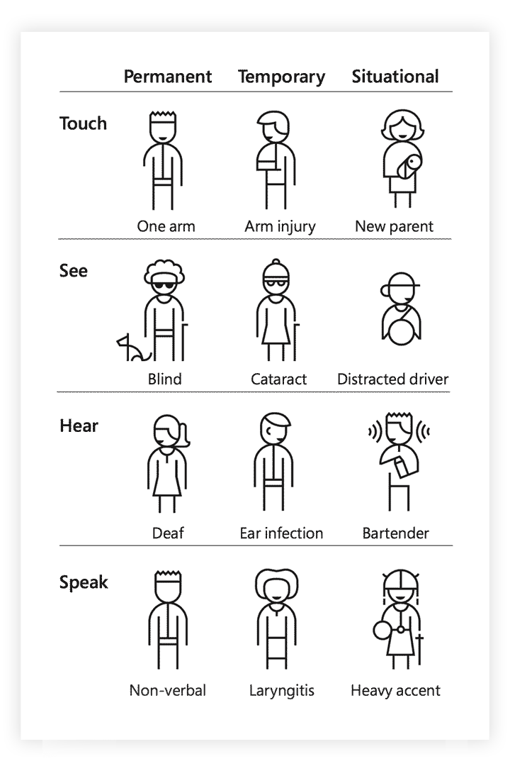
Accessibility isn’t only for people with permanent disabilities; it’s for everyone at different moments of their life. A mother might be using an app with one hand while nursing a baby. A driver might use voice commands while their hands are on the steering wheel. Designing for these situations makes an app or website more usable for everyone.
When designing products, we talk about empathizing with the user to understand what they want and need. It’s important to include accessibility into the research stage of product development. Learning how people adapt to the world around them means spending time understanding their experience and perspective.
Here are a few resources to help you understand how differently-abled people might use the web:
- Learn more about Diverse abilities and barriers from W3.
- Use Empathy Prompts to help you understand what it’s like for people with disabilities to use the web.
- Personas for Accessible UX or Web User Stories by W3 can help you understand new perspectives and provide additional context when user research isn’t available.
The basics of accessible design
Now that we understand what accessibility is and why we need it, here’s a quick checklist you can use to design an accessible product or website:
- All text should have sufficient color contrast.
- Ensure meaning is not communicated through color alone.
- Consider your font choice. Choose fonts that have clear and distinct letterforms. Specialty fonts with cursive, unusual shapes, or artistic features may look nice, but they are much harder to read.
- Use headings to communicate hierarchy. Ensure heading styles differ from paragraph text by some combination of size, weight, face, or color.
- Design focus states for all elements on a page that are interactive.
- Create emphasis on interactive elements to make them easily identifiable.
- Ensure that there is enough space separating elements so they can be properly clicked.
- Use clear, specific language for any copy. Avoid discipline-specific jargon.
- Provide specific and actionable feedback and error states.
- Images that convey meaning should include rich alternative text for screen reader users. Decorative images should have empty alternative text.
- Consider keyboard navigation for users who don’t use a mouse.
In the next chapter, we’re going to get into the weeds about how to properly design specific components for the web. Here, we’ll see how we overcame challenges to design accessible focus states, form fields, and more.
DockYard is a digital product agency offering custom software, mobile, and web application development consulting. We provide exceptional professional services in strategy, user experience, design, and full stack engineering using Ember.js, React.js, Ruby, and Elixir. With a nationwide staff, we’ve got consultants in key markets across the United States, including San Francisco, Los Angeles, Denver, Chicago, Austin, New York, and Boston.
